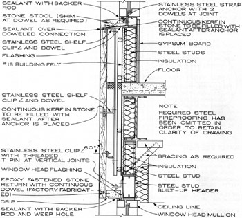
SCALE: a proportion used in determining the dimensional relationship of a representation to that which it represents.


In the history of architecture, scale goes hand in hand with social hierarchy and religion. An obvious example of scale and religion is the Temple of Amon at Karnak. This superhuman structure “commands the common people to worship the Gods”. By towering over humans, the structure exaggerates the importance of religion in Egyptian culture. The construction is heavyweight, thought the flared walls underscore the heaviness. The temple is guarded by two stone deities that protect what’s inside the temple, and keep unwanted things out. In terms of social hierarchy, Khufu’s pyramid represents his role as royalty. Out of four pyramids, his is the biggest, followed by those of his family members, and a series of mastabas or tombs for people of a lower class. Blakemore explains in History of Interior Design and Furniture the role that scale plays in social hierarchy. In Egypt, the higher the class, the more elaborate the decoration and the more complex the furniture. “Interior architectural detail and treatment of surfaces on the interior were regulated, in part, by the hierarchical status of the resident” (Blakemore, 9). She explains on page 15 that the first type of seating began as a stool, but gradually advanced to a chair with arms and a backrest. “More elaborate chairs used more expensive materials and methods, especially for royalty” (Blakemore, 19). When talking about Greek Architecture, Roth explains “On the highest ground the principal palace was built…” (219). This shows a connection between scale and hierarchy. The Parthenon is considered to be one of the most important buildings of Greece, and therefore it is the largest, and can be seen on the Acropolis from anywhere in the city below. This idea of scale in architecture coincides with our exercises in drawing class. In order to justify a space, one must involve people. Therefore, the scale of the space must interact with the people inside of it, whether it is intended to create a sense of authority or a sense of level. In other words, there must always be an interaction, even if it involves hierarchy or not.
SECTION: A part cut off or separated; the appearance that a thing would have if cut straight through.


There are two different definitions of the word “section”; both apply to architecture. In both Egyptian and Greek architecture, a Tripartite system exists. The Egyptian temple consists of three sections: (1) the pylon and courtyard, often with a portico, (2) a hall in which the ceiling or roof was supported by columns, termed hypostyle, and (3) the naos, or sanctuary, which contained the statue of god (Blakemore, 3). This is similar to the Greek Megaron, which is composed of (1) a hall, (2) a storeroom at the back, and later (3) a porch (Blakemore, 31). So to use terms from class, both systems consist of a (1) porch, which acts as a place of transition, (2) a court, which involves gathering of people, and (3) a hearth, which is reserved for special people, such as a priest, or the statue of a god. Each section in these systems serve an important purpose for the system of worship in those two countries. Sections also relate to social hierarchy in a sense that they obtain specific spaces for specific people, separating levels of class. Referring to the second definition, a section cut in drafting shows what a building would look like if it were cut straight down, displaying the structure of walls and roofs as well as slight detail of the interior. We have been asked to draft two sections of the chairs we made for Pat, which I have shown above.
BOUNDARIES: something that marks or fixes a limit (as of territory)
With the intention of protecting hierarchy and religion, boundaries are made around cities. One could argue that the Nile in Egypt, as well as the Mediterranean Sea near Greece, act as boundaries, defining those areas. However, I see these two important bodies of water as a means of communication and courtesy rather than boundaries. As for architectural boundaries, most important buildings are surrounded by walls. In Egypt, villas and mansions were surrounded by thick stone walls, and in order to enter, it was necessary to walk through a gate. The villa, composed of many other buildings than just the house, had a “walled enclosure” (Blakemore, 7). The city mansions also “shared common walls with neighboring mansions” (Blakemore, 7). Motes, acting as boundaries, protect the Khufu pyramids with the intention of avoiding robberies. These Egyptian boundaries act mostly with the intention of protecting religion and hierarchy. It is a similar case with Greece. In Greece, the acropolis is not only surrounded by walls, but also has quite a complex entrance. The Propylaea is a massive building designed to accommodate a procession. This entrance is like a mysterious hallway into the acropolis. Inside the Acropolis, there are multiple buildings that are symbolic of Greek worship, and therefore it is necessary to surround them with boundaries. Citadels are also contained within walls, in order to act as cities, housing many people, and also providing a temple for worship.
UNITY: the state of being one; a whole or totality combining all parts into one


John Kurtich and Garret Eakin define interior architecture as “the holistic creation, development and completion of a space for human use.” Blakemore’s book has already illuminated the word “unity” for me. The beliefs of both Egyptian and Greek culture unify architecture and furniture design. In the last “ornament” paragraphs of both chapters one and two (pages 25 & 44), Blakemore sums up the ideas that go into design. In Egypt, she speaks about the symbolism and the incorporation of motifs such as “winged sun” and “the serpent”
into both architecture and furniture design. With Greece, she notes the repeated use of different patterns, such as concentric circles, plant life and wave patterns. These patterns bring
exterior (architecture) and interior (furniture design) together. Unity is also found in the locations of many buildings. For example, The pyramids of Khufu are built ON the earth, in a graduating height, so that as you move your eye from the top to the bottom, the pyramids seem to disappear into the ground. However, the temple of Hatshepsut is built OF the earth, being built into a cliff, unified with the earth. Gestalt principles enforce unity as well, and these ideas, such as symmetry, similarity and continuation, can be found in multiple buildings in both Greece and Egypt. Some examples of these principles are the Parthenon (symmetry and
proximity), the pyramids of Khufu (symmetry and continuation) and the temple of Hatshepsut (symmetry and proximity). These gestalt principles also apply to the unit we are touching on in drawing. We are learning to place figures in an environment in order to create a sense of unity in the interaction between those figures and the space. Proximity, or the way you place things, is important because it can represent a good or bad interaction. Symmetry is important to create a balance in a space, and repetition enforces intention, if any exist.
VIGNETTE: A picture that shades off into surrounding ground; a short descriptive literary sketch.

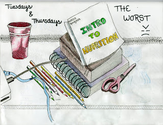

The word “vignette” applies more to what we have been doing in drawing class than what we have been learning about in history. HOWEVER, vignettes did begin in the histories of Egypt and Greece. Heiroglyphics were pictures and symbols painted or carved into walls and floors of Egyptian temples. For the readers (the Egyptian people) these “writings” may have been somewhat literal, but for our generation, these pictures are simply vignettes. They tell a story, but it is more difficult for us to understand the meanings because (a) we don’t read heiroglyphics and (b) these paintings or carvings are aged, and therefore, they are faded or weathered. Greece had a similar system in terms of motifs that they incorporated in their design, and once again, it is hard for us to fully understand the intentions. In drawing, we have been drawing and painting vignettes. Vignettes go hand in hand with unity because in order for them to make any sense, there must be an element that ties all the pieces together. For example, in my vignette above (the academic scene), the order of things as they are placed on my desk are the elements which unify the story. They bring the story full circle. If I had drastically placed them all over the page, the story would be more confusing and messy.
If there were one word that served more purpose than the rest in this group of words, I would choose the word "unity". Unity is a crucial part of design, and I do think that all the rest of the words support it. Scale plays a role in the unity of interaction between people and spaces. Section is a part of the whole (or the unit), and therefore just a tiny part of unity. Boundaries surround a unit, defining it as a whole space, rather than a section. Vignettes require unity in order to portray their definition. These four words are not the only elements that are incorporated in unity. There are many others as well, which is why the term is so important. If a design lacks unity, it most likely lacks most of the elements involved, making it less of a design and more of a mess. Unity is vital for a connection between interiors and exteriors, and without that connection, interior architecture would not exist.
 This first drawing is of my roommate and our really good friend just chilling in our room watching tv, and using the computer. Though I didn't go out and draw random people, I didn't tell them that I was drawing them, and therefore, they went about their business, doing what they would usually do.
 The second one I did outside at the fountain on Saturday when we got that sudden burst of warm air and sunshine =). At first this kid thought I was drawing what was behind him, but as I continued, I think he caught on, because he became fidgety and hesitant with his motions. The third I drew while we were watching our wall presentations (don't kill me please). My classmates had no idea that I was watching them as their heads began to droop onto their arms, and their pencils began to draw away.


 Vitruvius speaks about this idea of “utility”. Function is the “surface element” of design, and though it seems relatively straightforward, it’s more complex than some think. When thinking about commodity, a designer must acknowledge the future: What role will this building play in the years to come? This raises the topic of universal design, or “designing a building so that a possible future activity can be accommodated” (Roth, 14). Function is constantly changing, and therefore it is important to design something that will be able to adjust to change. There are three types of function: utilitarian, circulatory and symbolic. In utilitarian function, the building must accommodate multiple uses. In circulatory function, the goal is to “make appropriate spaces to accommodate, direct and facilitate movement from area to area” (Roth, 15). Last but not least, symbolic function is shown in a building when a building “makes a visible statement about its use” (Roth, 16). All of these types of function create a commodity, or in this case, a building that can be useful in the present, as well as the years to come. The chair that I designed for Pat portrays commodity. In utilitarian function, the chair serves as a seat, server, table AND workstation (multiple uses). In circulatory function, the chair directs the user to the seat to sit, to the bookshelf to store, or to the table to serve or work. In symbolic function, the chair blatantly states its uses in its design. Commodity varies within certain cultures. Depending on values, buildings will be used for different reasons.


 Rather than automatically referring to the text, I’m going to refer to our task to create an inspiration board last week. We were asked to think about design elements in our story (light, color, pattern, texture and scale) and how they were incorporated into our story. Looking over last week’s notes, it was interesting how clear the cycle of a story could be from light and color, instead of words. In the exercise that we did last week, we were asked to choose artifacts that describe us, in brief words and a drawing of an artifact. The CD above illuminates one of my interests. Like these aspects illuminated the highlights of the story, and like the way the artifact illuminated an interest, the design elements illuminate a design. They imply certain