SOURCE: Any thing or place from which something comes, arises or is obtained; an origin.

Source is a major component in architectural development. It has to do with the foundations of architecture, or where architecture comes from. Sources are extremely important in history because they give further information about subjects that are potentially difficult to understand. “Documentary evidence from literary sources, reliefs, wall paintings, sarcophagi, and marble and bronze parts extend our knowledge about the characteristics of Roman furniture” (Blakemore, 61). Not only do sources like these help us understand furniture, but they also help us understand architecture. Because it is a city buried under lava, the city of Pompeii is somewhat preserved, and the buildings are more complete than those of a city that might have been destroyed in a battle. The structures and shapes of these buildings, as well as the untouched facades, allow us to examine the existence of civility in Roman culture. From the preservation of this city, we are able to extend our knowledge about the roadways, forums, theatres, basilicas, temples, baths and commercial spaces that played a role in culture. Beyond literal sources, Egyptian and Greek architecture are sources, or PROTOTYPES, for Roman Architecture. The Romans assimilated many aspects of these two cultures, and combined and refined them into a new style of architecture, which I will explain further as this blog continues. In drawing, we have developed a skill in drawing thumbnail drawings, which are basic drawings showing only the important aspects of building. These thumbnails are sources for larger and more detailed illustrations to come.
ARCHETYPE : PROTOTYPE : HYBRID
ARCHETYPE: the original pattern or model from which all things of the same kind are copied or on which they are based; a model or first form; a prototype
PROTOTYPE: The original or model on which something is based or formed; something that serves to illustrate the qualities of a class; an original, full scale and usually working model of a new product or new version of an existing product.
HYBRID: Something of mixed origin or composition.
These three words create a system. The prototype is the first level of this system. The prototype is the first model ever made, and becomes the basis of every model of that same design that will ever be built. After the prototype comes the archetype, which is the transformation of the prototype into something more advanced that perhaps better meets the goals of the builders. Last but not least is the hybrid. The hybrid is the combination and expansion of ideas from all those prototypes before it. It may act as the final model at certain points in time, but it will never be final. Why? Because every type of design is a prototype for the next. As we have discussed several times, the cycle of design has constantly changed with trends and styles. Architecture continues to expand with every new generation of culture. Although these designs are hybrids in that they are combinations of previous ideas, they continue to be models for future architecture.

The Parthenon in Greece is the archetype of the temple forms. Why? It is the ideal design for worshipping the Gods. It serves all the purposes intended by the Greeks such as those discussed by Roth. When describing the Greek character on page 220, Roth mentions that “the mixing together of aspects of the sophisticated Minoan/Mycenean cultures with the pragmatism of the Dorians produced a unique Greek character, emphasizing inquisitiveness, a love of action, and the desire to achieve perfection in human intellectual and physical endeavors”. The temple of Hera, built around 600 BC, was merely a prototype of the Doric temple. The design of this temple was continuously refined, and created an idea that moved towards more complexity and order, such as the Temple of Athena. The Parthenon was then built, along with many other temples on the acropolis, with means of finding the ideal form. “Both in form and in ornament, Roman design was based on Greek prototypes” (Blakemore, 67). When Rome became the Roman Empire (taking over Greece and parts of Egypt), they adopted much of Greek architecture, including the Greek orders, to create new hybrid buildings, such as the Pantheon. Assimilating this idea of worshipping the Gods by temple, they created the Pantheon. “The Roman temple, templum, based on Etruscan prototypes, was similar to the greek temple and eventually was embellished with Greek orders
and architectural details” (Roth, 250). The idea of the Pantheon was to create a universe between earth and the Gods. In order to further this goal, the Romans used an oculus, or an “opening to the heavens”. Not only is the Pantheon a hybrid, or combination of earlier design, but it is also an “embryonic prototype” for buildings to come. For example, our capitol building in Washington D.C., as well as many other government buildings throughout America, resembles the infamous dome on the Pantheon.

ENTOURAGE: surroundings or the environment; (in architecture) the landscaping and other nearby environmental features shown on a rendering of a building.


Entourage is what shapes architecture. Roman architecture was primarily influenced by entourage. “Foremost among these influences were geographic position, conquests, technology, priorities in social life, and religion” (Blakemore, 45). In other words, Roman architecture was shaped by its inclusion of both Greek and Egyptian culture in its empire, along with its dedication to religion and politics, and its ability to innovate new technologies. For example, the Colosseum accommodates the practice, of “bread and circus”. It creates a space that brings people together and distracts the populus from political situations, while the forum is an open space whose primary intention is to house politics and social gatherings. Incorporation of physical surroundings was also an important aspect. In Rome’s case, nature was ignored if it was considered a burden. “If a stony mountain outcrop loomed in the way, they simply cut through it” (Roth, 250). Dedication to religion and politics included the development of many temples and forums for praise and hard work. As for new technologies, Rome developed many new building techniques, such as the arch, the vault, the dome, the basilica and the aqueduct. Concrete became the major building technique, giving way for these heightened developments in architecture.
HIERARCHY: Any system of persons or things ranked one above the other; a series of ordered groupings of things within a system.

^ The order of ranking (the top is highest class, the bottom is lowest)
The wu-wu’s and the arches are both obvious examples of hierarchy. Roman culture was all about marking territory and competing with others. The wu-wu is a vertical single column that guards the landscape of Rome. It represents the importance of masculinity and illustrates the motto “the bigger, the better”, and also enforces the strength of politics and the military. Around this wu-wu, there are scrolls of stories conveying the hierarchy of government during times of battle. For example, the column of Marcus Aurelius commemorates his multiple military campaigns against many other empires. This column is placed in the middle of the Piazza Colonna, exaggerating its scale and emphasizing its importance. The arch is a “ceremonial gateway” that celebrates victory and represents transformation. This, too, is covered in reliefs that tell stories about the supposed hierarchy of Rome over other empires. Both forms are intended to enforce this idea that one culture is greater than the other. Hierarchy also relates to use of material. For example, the woods that were most valued in Roman furniture were maple and citron, which were most likely used for beings of a higher social class, whereas oak and cedar were used for middle or lower class people. The metals used for reliefs and decoration of chairs and tables varied with class as well. Applying the word "hierarchy" to interior elements, the walls were made more important than the ceilings through the use of glass and mosaics.In terms of the elements of design, hierarchy is used to put emphasis on what is important and distract the audience from what isn’t. For example, if a designer wanted their client to focus on the couch, she would place the couch in the middle of the room, and design everything else in relation to the importance and placement of that couch. If a designer wanted to create a mood by using color, he or she would only use one color, and perhaps some undertones that compliment that color, but there would not be a confusing mixture of other elements.
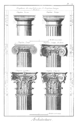
ORDER: any of five such arrangements typical of classical architecture, including the Doric, Ionic, and Corinthian orders invented by the Greeks and adapted by the Romans, the Tuscan order, invented by the Romans, and the Composite order, first named during the Renaissance.


The word order has two meanings in architecture. The first applies to the Greek orders, which were eventually developed by Romans. The orders are in order (no pun intended) from early to more recent above. The Doric column was the first column used, which became a prototype for further orders, as they became more detailed as time went on. The Doric order consists of no base, and a capital of banded necking and a square slab (Roth, 30). This is drastically different from the precise ornament of the composite order. The composite order “places the volutes of the Ionic capital atop the curled ancathus leaves of the Corinthian” (Roth, 31). In Greek architecture, the orders were used for structure, as seen in the Parthenon, holding up the roof. However, the Romans used the orders for delight rather than structural function. Not only did they “piggyback” off of the use of the orders, but they also developed a new “engaged” column. This column is actually a half-column that “merges the column with the wall” (Roth, 31), acting as a pilaster. This example furthers the idea of prototype and hybrid. The Greek orders act as prototypes for Roman columns. The Romans took the best aspects of the Greek world and changed the physicality. In the colosseum, the Romans used all 3 Greek orders, one on each floor: the first being Doric, the second being Ionic, and the third being Corinthian. This inclusion of all 3 orders was intended to represent the passage of time, and the passage of ideas with time.
The second use of the word “order” has to do with organization and composition. The combination of architecture and design creates a sense of order within a space. In interior architecture, it’s crucial that an interaction exists between the interior and exterior in a space. This interaction creates a sense of order in that it gives way for the connection of elements, such as contrast, balance, symmetry, etc. Without order, a design would not be sufficient. I’m not sure it could even be considered a design. The word “mess” is probably more appropriate.
This brings me to my stitching of all these concepts together. The title for this blog is appropriate in that it recalls the idea that interior architecture is a “holistic creation” (John Kurtich and Garett Eakin). Every word in this blog has some connection with the integration of architecture, or the bringing together of parts to create a whole. Source covers the foundations of architecture, and the cultures that are the basis of all design. The words archetype, prototype and hybrid depict the passage of ideas from one generation to the next. Entourage touches on the incorporation of context into architecture, and how the two are integrated to create a successful design. Hierarchy puts emphasis on the intentions of the designer in creating a comfortable environment. Order creates a sense of interaction between different elements in the design of a room or building. Therefore, these words are all parts of the whole. Of course, they are not ALL of the parts, but some of them that contribute to the whole of architecture.


 This second moment was intended to bring focus to the round desk in the middle of the first floor. In my inspiration, the artist used lines in colored pencil to show form and direction. I though this use of a different media was incredibly interesting. Originally, I had used lines, but in some spots it was unclear what was a room versus a window, and there was no scale figure. I added even more lines to places that were just solid color, and I continued floor lines to show where the floor was directed. I made it so that all the lines led to the center, making the main focus the desk.


 Moments create intimacy in design. They celebrate the excellence and success of a design. There are certain moments in design where the layout of a space becomes incredibly successful, and these moments are where the incorporated elements are obvious; where there is a sense of delight. Churches create moments for people to worship; these moments are crucial in religion. In the church of Santa Costanza this moment is in the circle. This circle creates a connection between heaven and earth. It provides a space in which people can worship to an altar, which is in the middle of the circle, raised on a platform. Baths create moments for people to be entertained; these moments are crucial in society. In the Baths of Diocletian, these moments happen during the enjoyment of each amenity, whether it’s in the gymnasiums, or the libraries or the theatres. These moments tell stories in that they tell how a space is being experienced. Each moment is linked by an aspect of design. In drawing class we were asked to choose 5 thumbnail drawings of a building that represent moments. I chose the places in the building where people walked or sat, or stood and had a conversation. These moments are crucial in the experience of a space.


 After drawing what we believed to be the plan of this building, our group was asked to contribute 12 thumbnail drawings of "moments" in the Mossman Administration Building. Where possible, we were to draw "spots" in relation to scale figures. Each thumbnail was only to take 15 minutes (maximum), in order to give us the oppurtunity to explore speedy depictions of space.

 The second one I did outside at the fountain on Saturday when we got that sudden burst of warm air and sunshine =). At first this kid thought I was drawing what was behind him, but as I continued, I think he caught on, because he became fidgety and hesitant with his motions. The third I drew while we were watching our wall presentations (don't kill me please). My classmates had no idea that I was watching them as their heads began to droop onto their arms, and their pencils began to draw away.


 John Kurtich and Garret Eakin define interior architecture as “the holistic creation, development and completion of a space for human use.” Blakemore’s book has already illuminated the word “unity” for me. The beliefs of both Egyptian and Greek culture unify architecture and furniture design. In the last “ornament” paragraphs of both chapters one and two (pages 25 & 44), Blakemore sums up the ideas that go into design. In Egypt, she speaks about the symbolism and the incorporation of motifs such as “winged sun” and “the serpent”
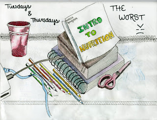
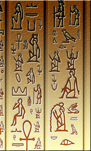
 The word “vignette” applies more to what we have been doing in drawing class than what we have been learning about in history. HOWEVER, vignettes did begin in the histories of Egypt and Greece. Heiroglyphics were pictures and symbols painted or carved into walls and floors of Egyptian temples. For the readers (the Egyptian people) these “writings” may have been somewhat literal, but for our generation, these pictures are simply vignettes. They tell a story, but it is more difficult for us to understand the meanings because (a) we don’t read heiroglyphics and (b) these paintings or carvings are aged, and therefore, they are faded or weathered. Greece had a similar system in terms of motifs that they incorporated in their design, and once again, it is hard for us to fully understand the intentions. In drawing, we have been drawing and painting vignettes. Vignettes go hand in hand with unity because in order for them to make any sense, there must be an element that ties all the pieces together. For example, in my vignette above (the academic scene), the order of things as they are placed on my desk are the elements which unify the story. They bring the story full circle. If I had drastically placed them all over the page, the story would be more confusing and messy.
 Vitruvius speaks about this idea of “utility”. Function is the “surface element” of design, and though it seems relatively straightforward, it’s more complex than some think. When thinking about commodity, a designer must acknowledge the future: What role will this building play in the years to come? This raises the topic of universal design, or “designing a building so that a possible future activity can be accommodated” (Roth, 14). Function is constantly changing, and therefore it is important to design something that will be able to adjust to change. There are three types of function: utilitarian, circulatory and symbolic. In utilitarian function, the building must accommodate multiple uses. In circulatory function, the goal is to “make appropriate spaces to accommodate, direct and facilitate movement from area to area” (Roth, 15). Last but not least, symbolic function is shown in a building when a building “makes a visible statement about its use” (Roth, 16). All of these types of function create a commodity, or in this case, a building that can be useful in the present, as well as the years to come. The chair that I designed for Pat portrays commodity. In utilitarian function, the chair serves as a seat, server, table AND workstation (multiple uses). In circulatory function, the chair directs the user to the seat to sit, to the bookshelf to store, or to the table to serve or work. In symbolic function, the chair blatantly states its uses in its design. Commodity varies within certain cultures. Depending on values, buildings will be used for different reasons.

 Rather than automatically referring to the text, I’m going to refer to our task to create an inspiration board last week. We were asked to think about design elements in our story (light, color, pattern, texture and scale) and how they were incorporated into our story. Looking over last week’s notes, it was interesting how clear the cycle of a story could be from light and color, instead of words. In the exercise that we did last week, we were asked to choose artifacts that describe us, in brief words and a drawing of an artifact. The CD above illuminates one of my interests. Like these aspects illuminated the highlights of the story, and like the way the artifact illuminated an interest, the design elements illuminate a design. They imply certain

